Our Favorite Color Palettes | How to Incorporate your Wedding Colors | NM Wedding Photographers
April 16, 2021
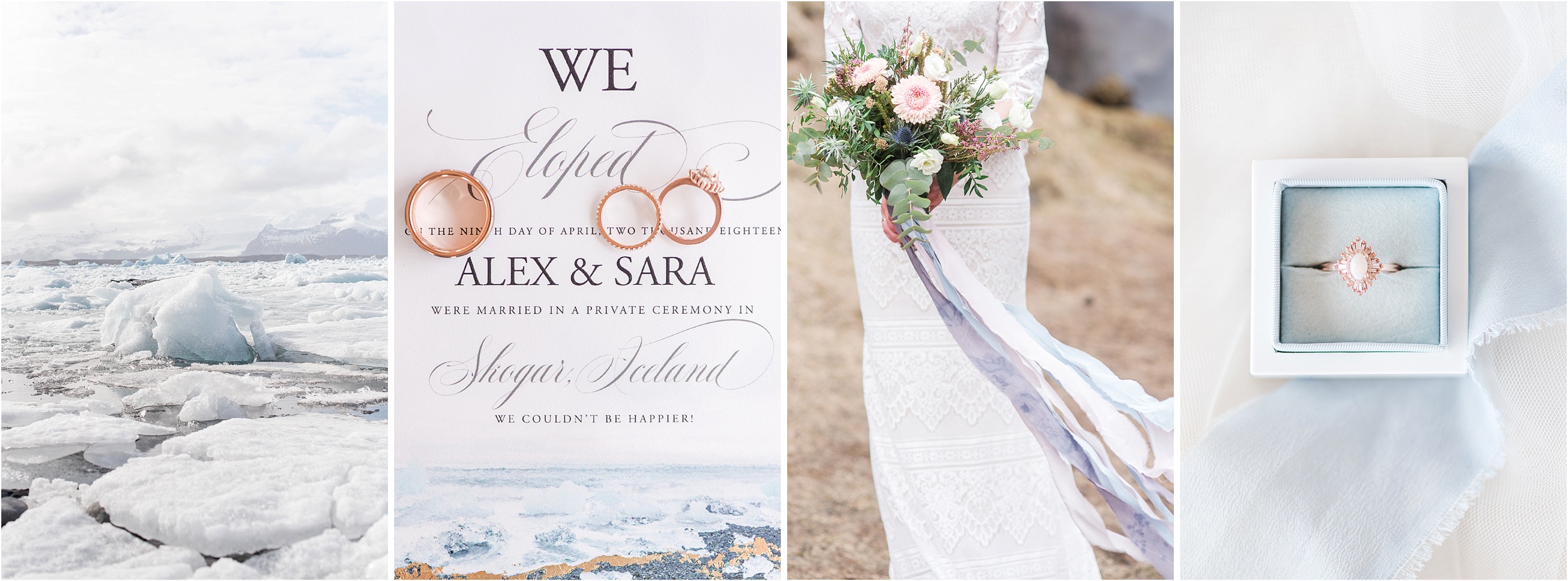
One of the most fun parts of planning your wedding is: choosing your wedding colors. There are so many options, combinations, and shades! But once you’ve decided what you want your colors to be, it can be tricky knowing HOW to show off those colors.
So we’re going to share some of our favorite color combos from our past weddings and shoots to help you figure out exactly how to incorporate your scheme into your big day!
Perfect Palette:
Smokey Blue
How to Incorporate:
Accessories and Invitations
In case you’ve never noticed, Maura Jane Photography is obsessed with blue. So naturally, we love when our couples choose to have blue wedding palettes. If you’re looking to incorporate your color in a more subtle way, our first suggestion will always be stationary. Your invitations set the stage for your wedding, and often times, are the first detail your guests will see.
Now you can accessorize in your chosen color in smaller ways that will still be noticed! The perfect way to do this is through your jewelry, (either earrings, necklace, or even another ring) or shoes.
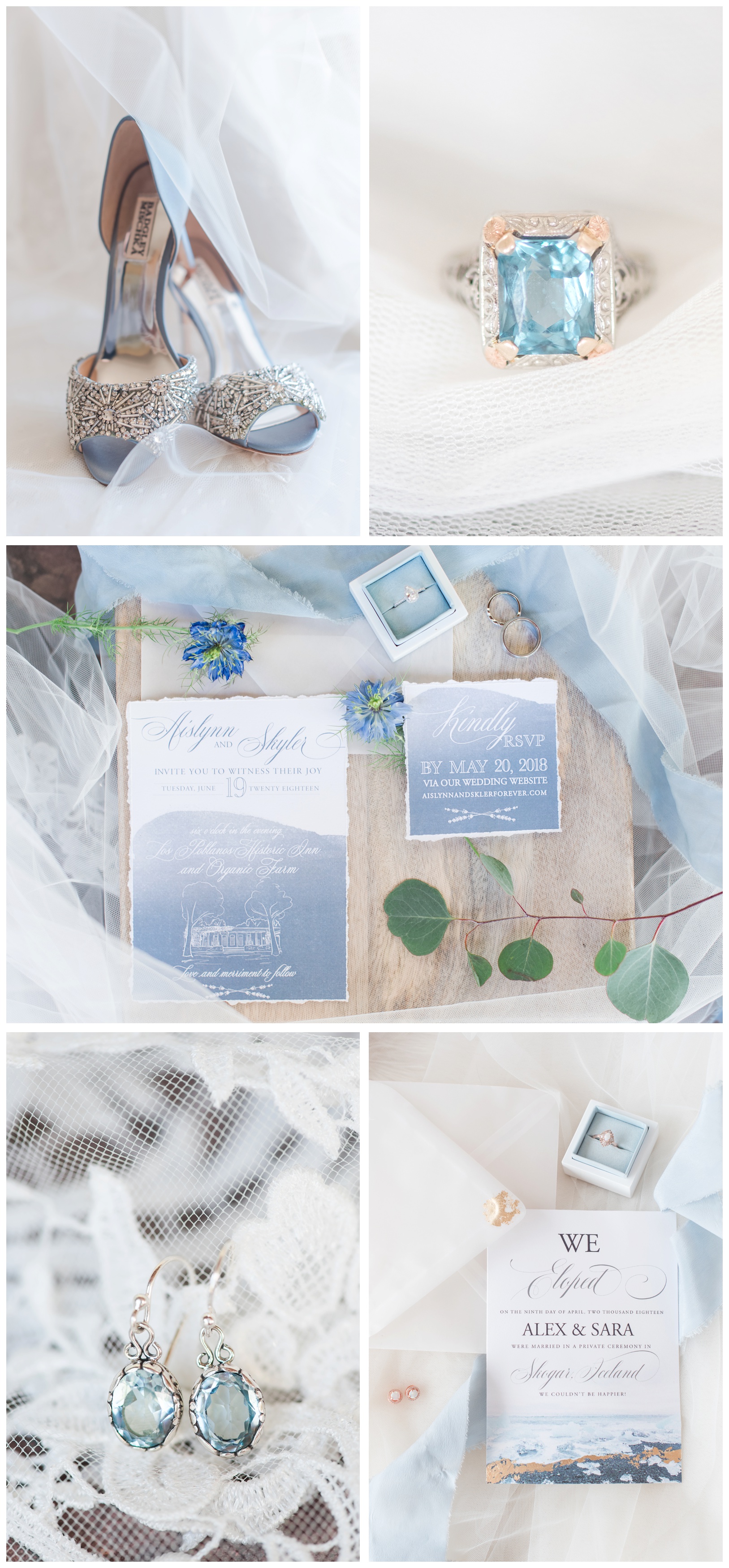
Our Blue weddings: Kelly and Anthony, Sara and Alex, Los Poblanos Styled Shoot
Perfect Palette:
Boho Burnt Orange
How to Incorporate:
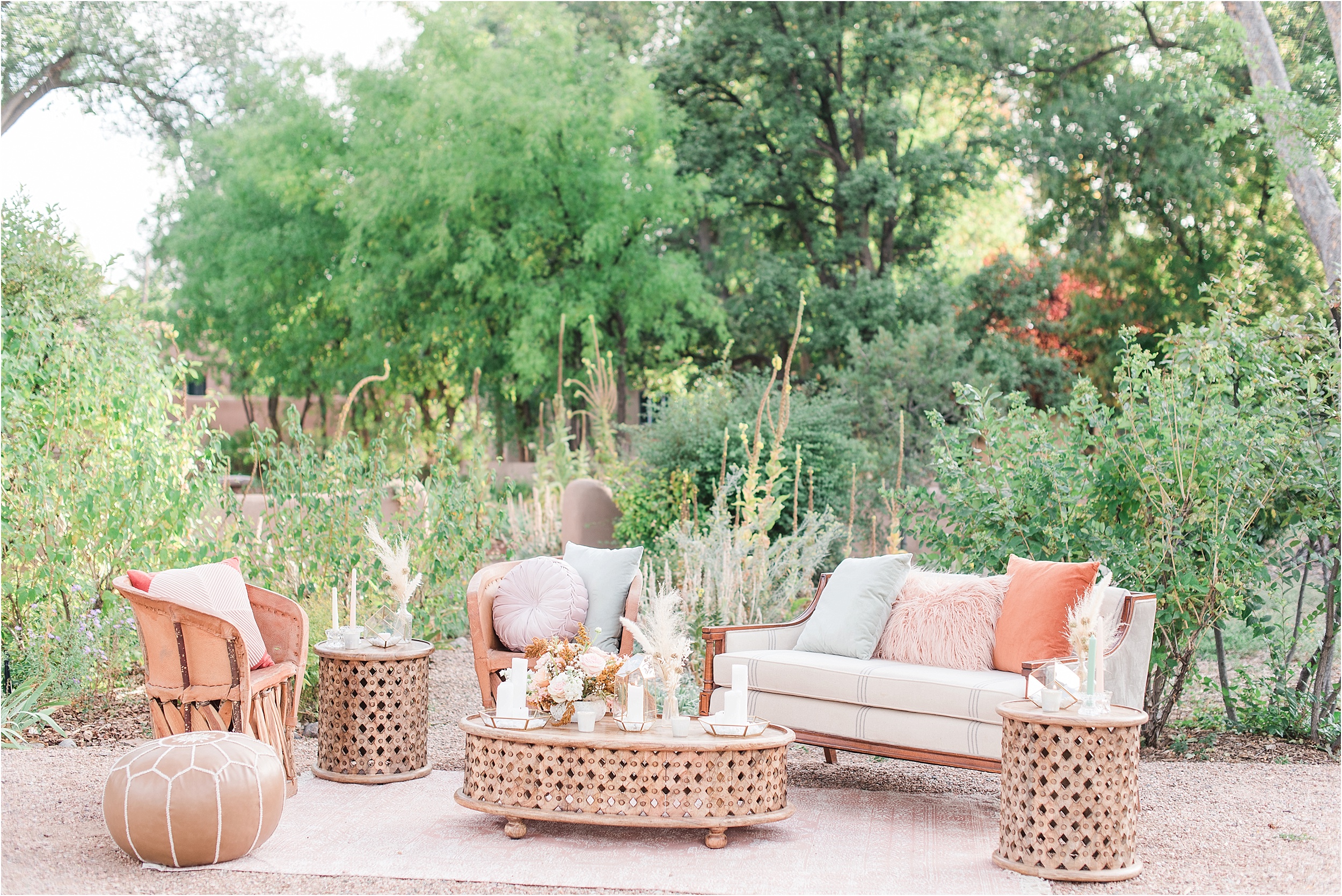
Pampas Grass and Reception Details
In the rise of the Boho Goddess trend, burnt orange is here and ready to play. If you think it’s a hard color to pair, think again! While it normally plays into a more moody color palette, you can still brighten it up and keep it feminine. Here we paired it with pinks, corals, and mustards, along with a navy suit to give it a whimsical air and stylish finish that pops!
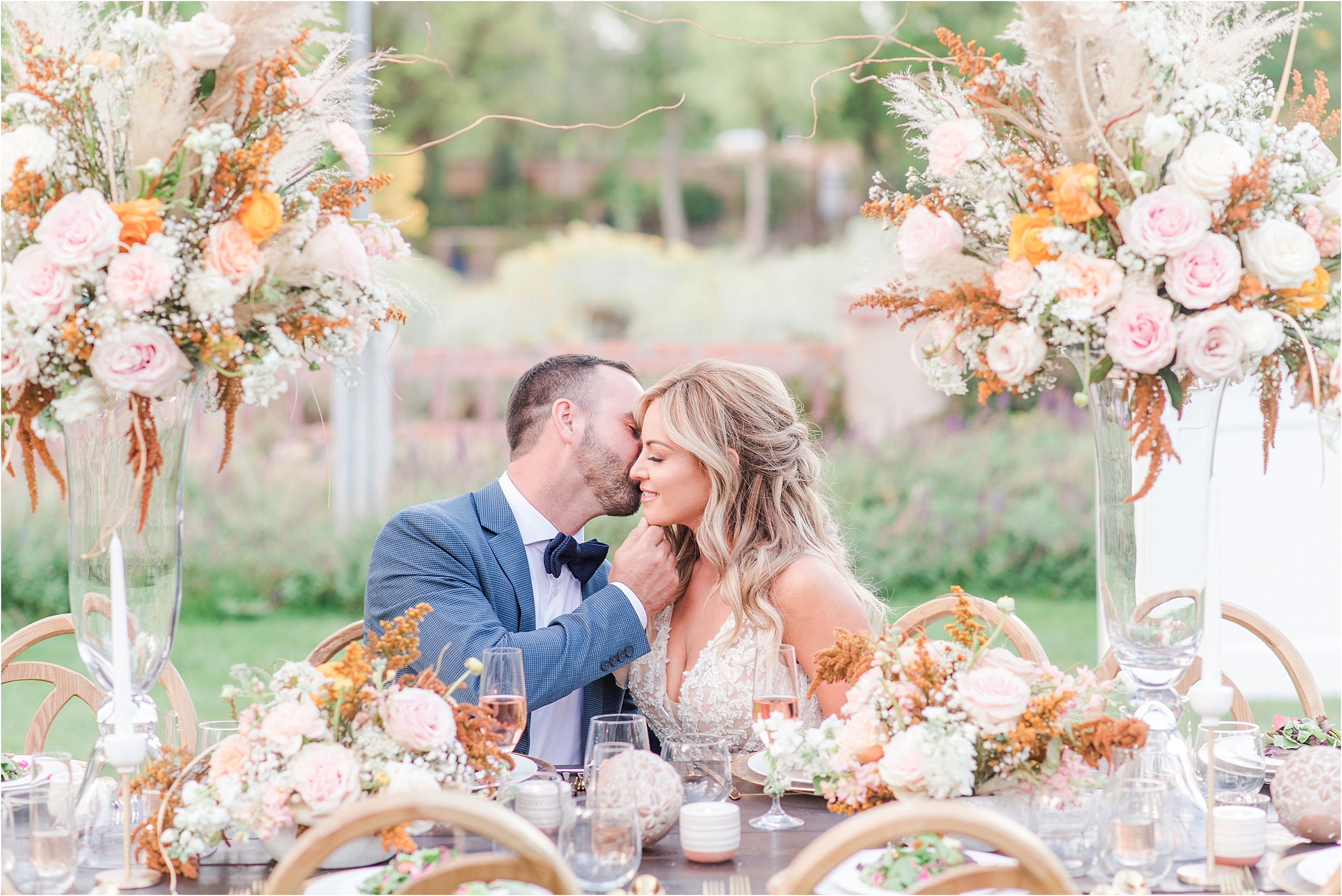
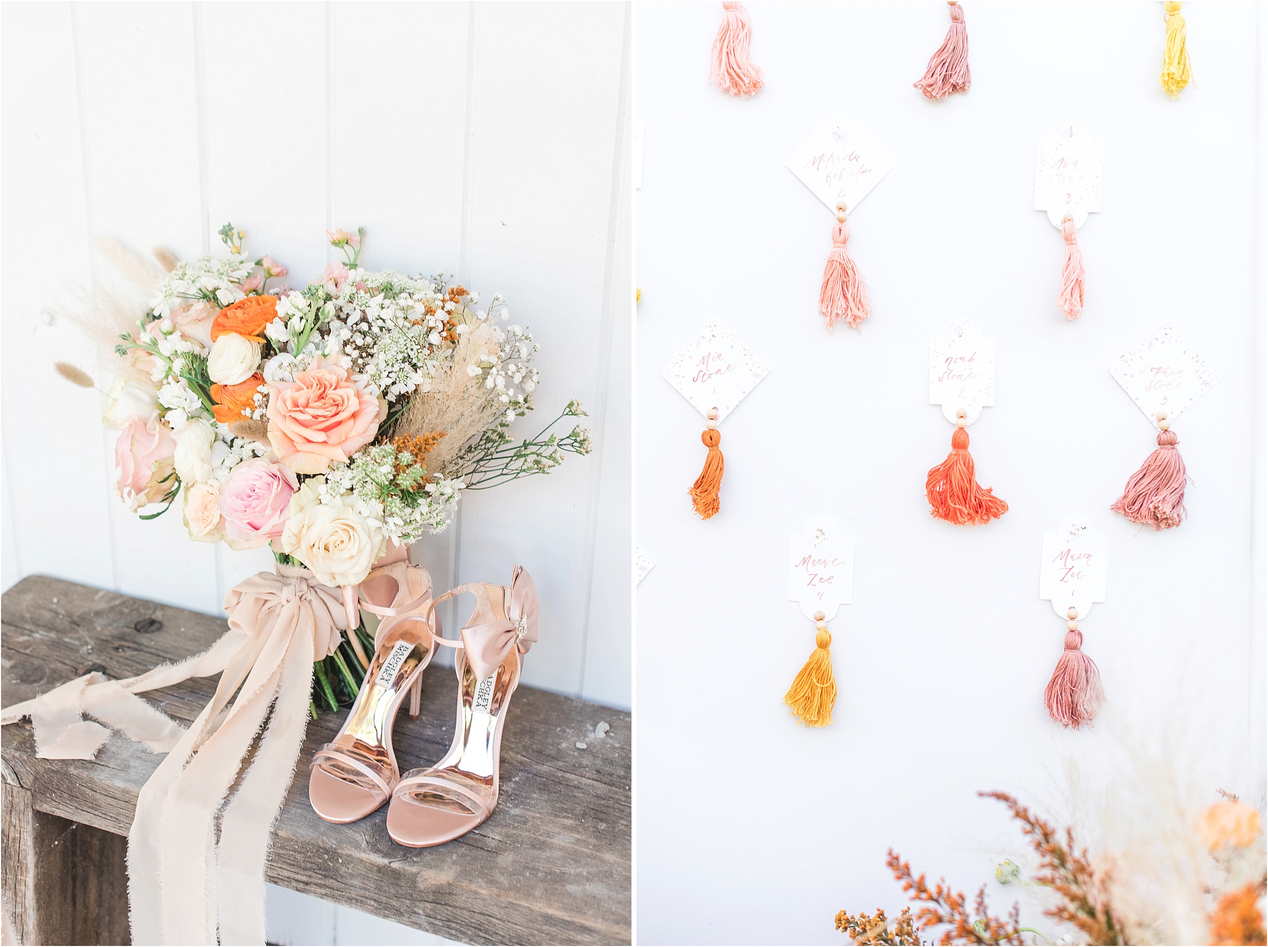
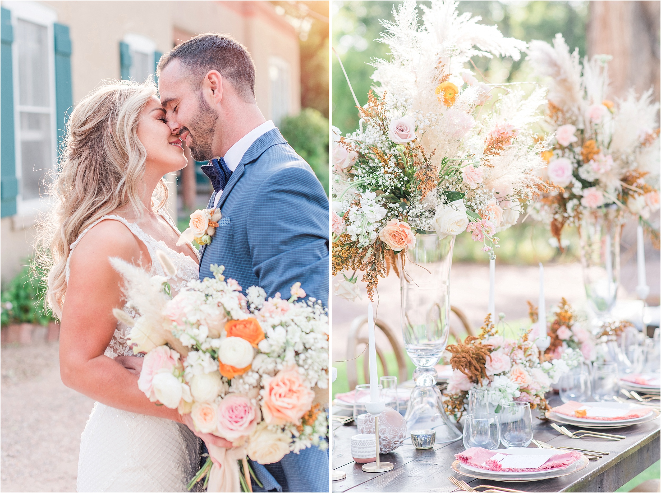
Boho Burnt Orange Weddings: Acequia Gardens Styled Shoot
Perfect Palette:
Dusty Pink and Burgundy
(We love this look with gray too!)
How to Incorporate:
Attire
Another favorite way to incorporate color? Attire! Just because you will most likely be in some form of white, that doesn’t mean that you can’t use everyone else’s attire to accomplish your color dreams!
The most obvious way to do this is with your bridesmaids. Many boutiques have all the options available for you to see in person. Online retailers have options for you to buy a swatch and have it delivered so you can feel confident about the shade before sending your girls to buy their non-refundable dresses.
And don’t forget about the groomsmen! They will be in ties or bowties, and usually have pocket squares, that you can use to tie in your colors too!
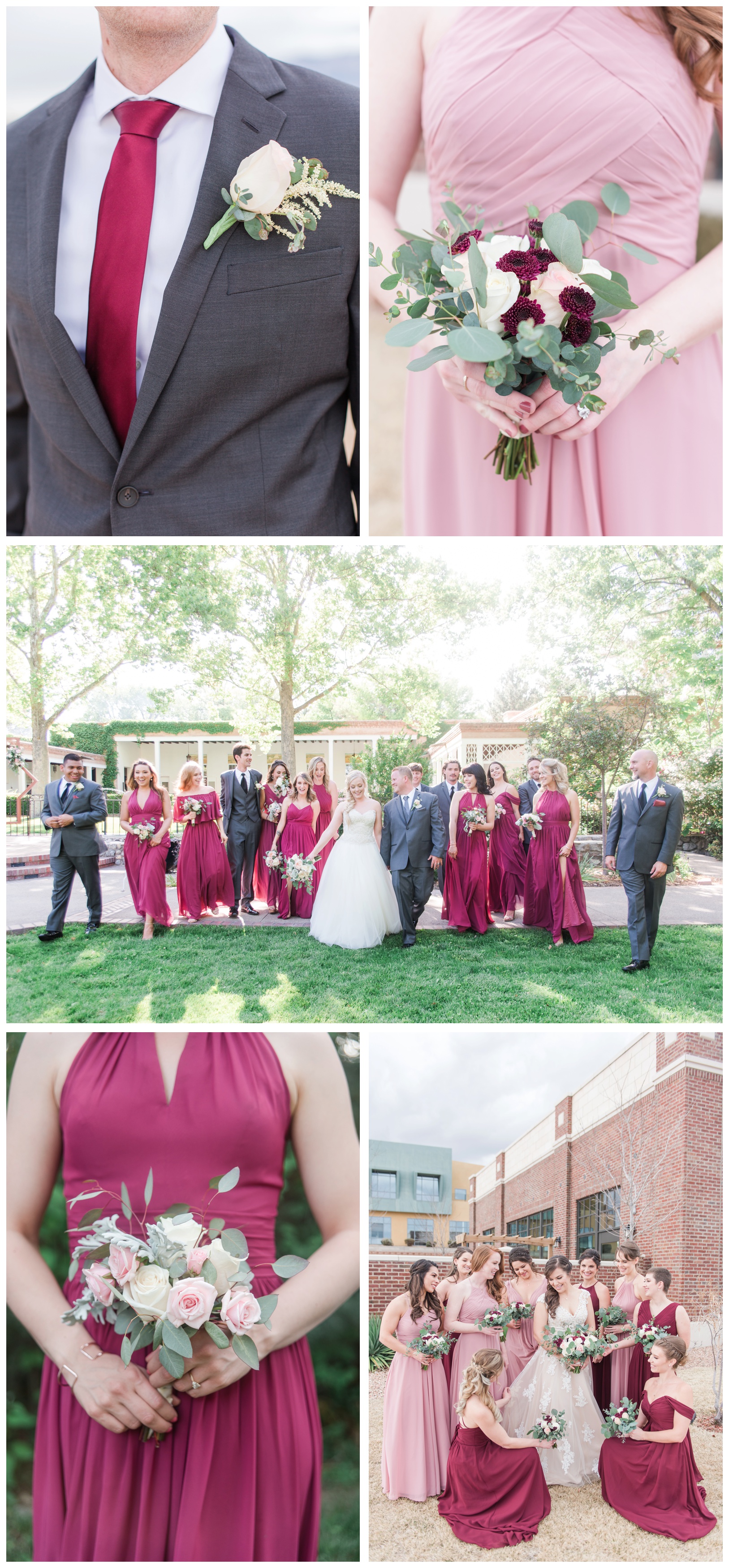
Pink and Burgundy weddings: Sara and Paul, and Crina and Eric
Perfect Palette:
Navy
How to Incorporate:
Reception Decor
Maybe you’re looking for more than just dresses to show off your theme. An excellent way to tie in your colors is with your reception decor, such as:
– Seating Chart
– Guest Book
– Center Pieces
– Signs (Welcome, Unplugged Ceremony, etc…)
– Table Linens
– Napkins
We personally love when couples have the table settings tie the whole reception look together. This usually means the napkins and the escort cards (or name plates) are the main color focal point, with the table’s florals or glasses in the color as well.
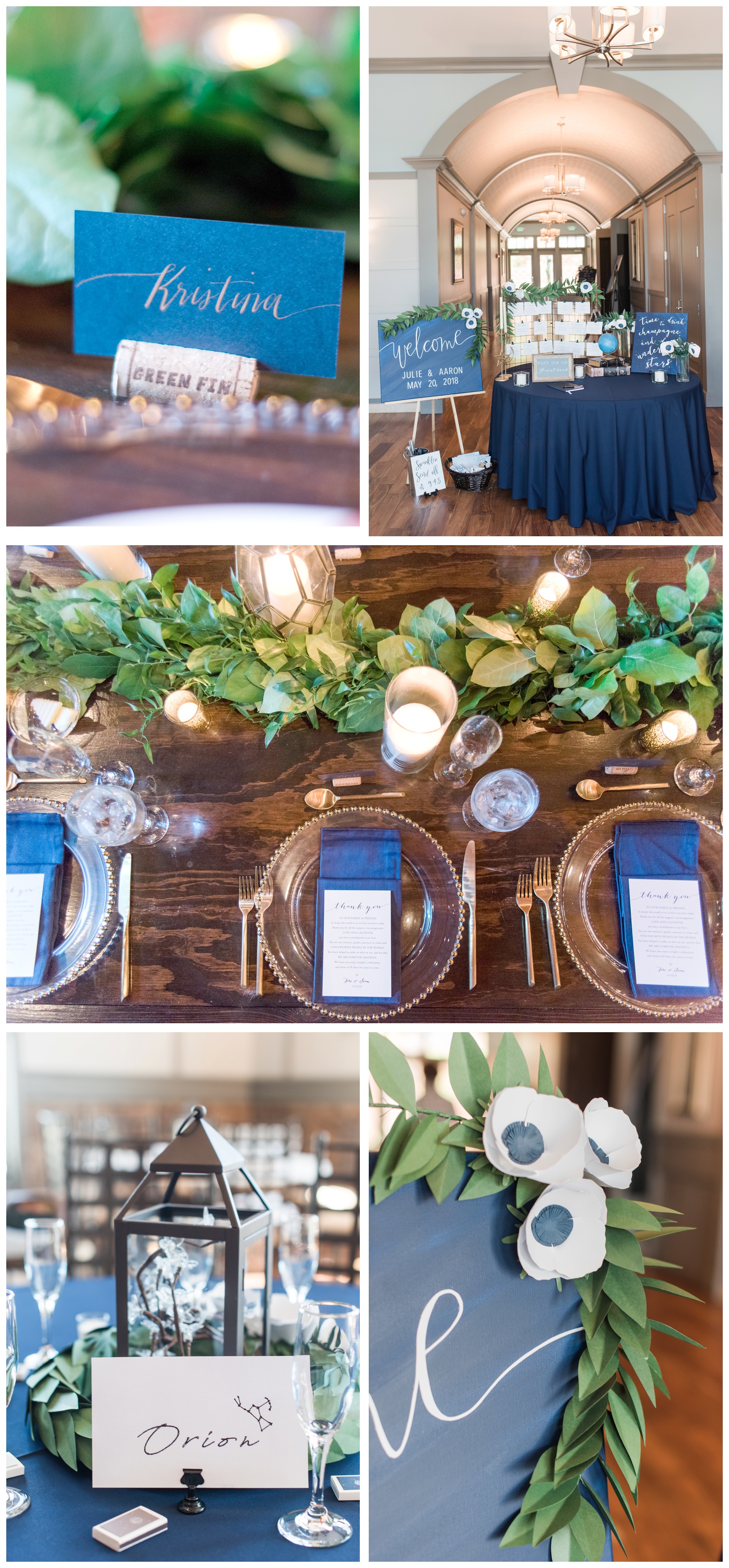
Navy Weddings: Julie and Aaron, and Tori and Sean
Perfect Palette:
Bold and Bright
How to Incorporate:
Flowers
Looking for a simple way to incorporate a bold scheme? Go with your flowers!
This can be your bouquet, your bridesmaids’ bouquets, or your groomsmen’s boutonnieres. You can set up your centerpieces with flowers, your head table, and you even top your cake with gorgeous blooms!
We personally always support lots of flowers at weddings (it’s one of our favorite parts,) so go wild with your florals and tie in your perfect palette with a bang that everyone will talk about years to come!
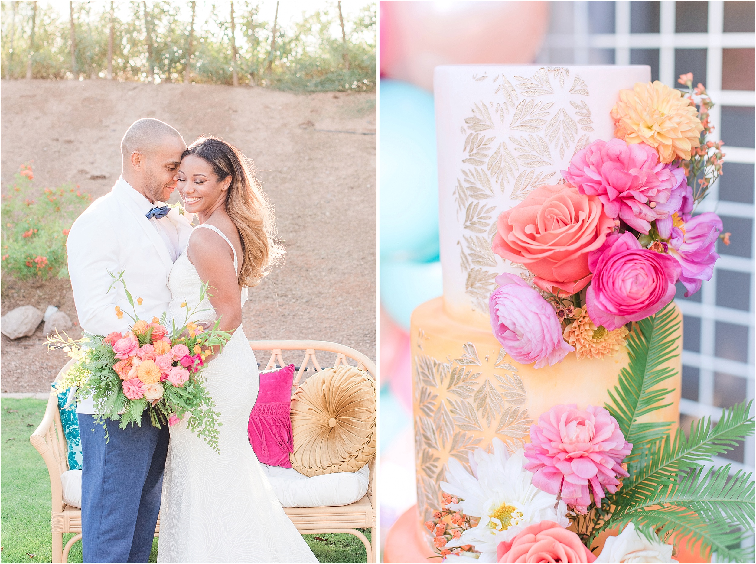
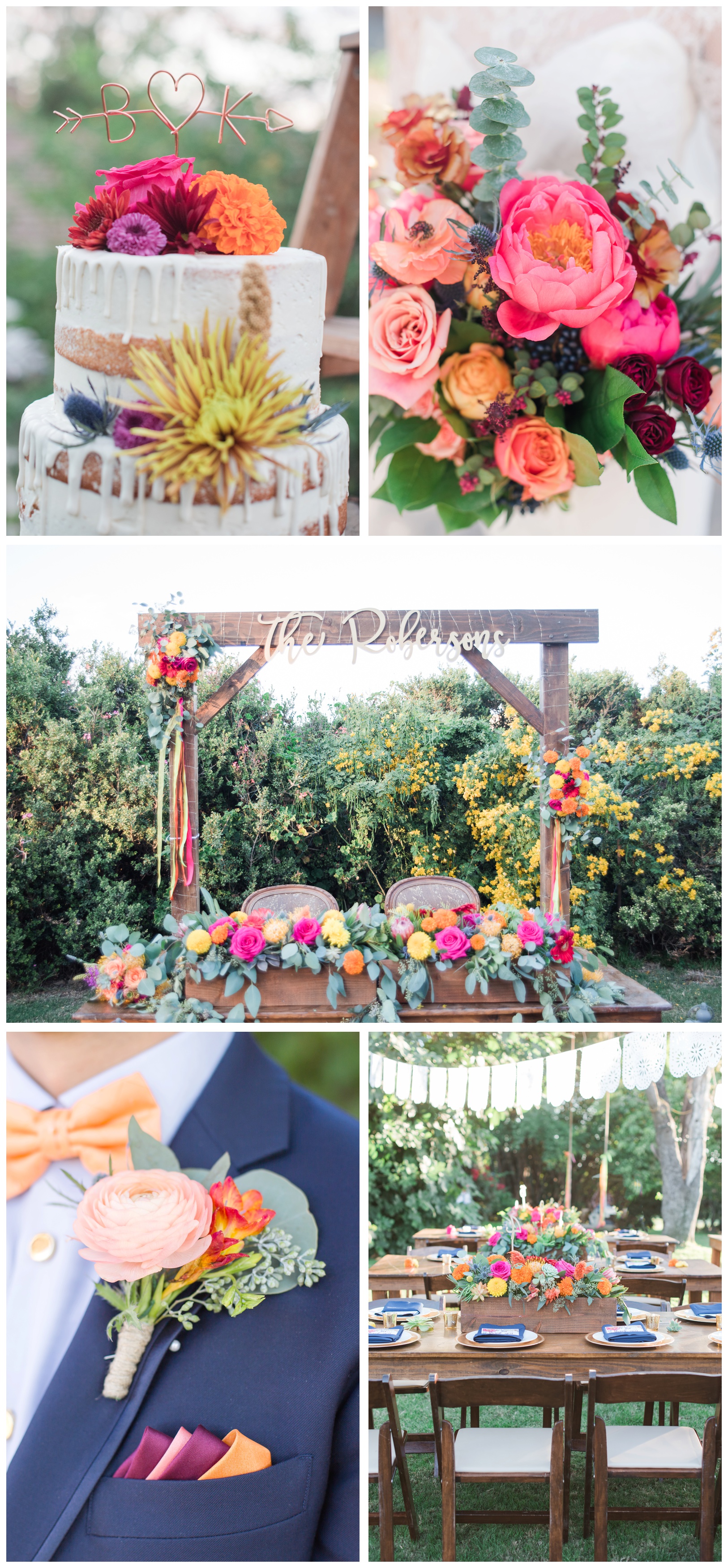
Bright and Bold weddings: Vibrant Palms Shoot, Michael and Erin, Katie and Bart, Caitlin and Justin
Perfect Palette:
Mustard and Sage
How to Incorporate:
Desserts and Details
If you’re having a fall wedding, this is the move. Yellow isn’t too popular in the wedding industry, but mustard? Ooo, she’s getting some attention. Depending on your photographer’s style, it can pull moody or brighter, but either way it’s neutral and muted enough to not be in too in your face— plus, it’s a much more flattering option on all skin tones, should you happen to want it for bridesmaids dresses. Paired with sage, these muted colors are *chef’s kiss.*
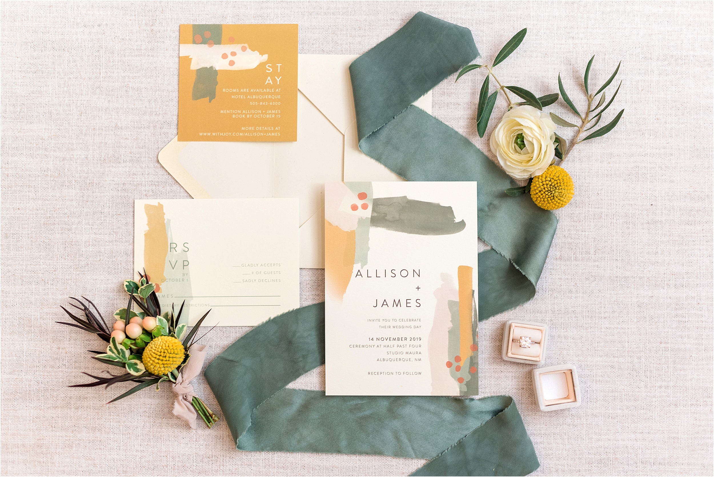
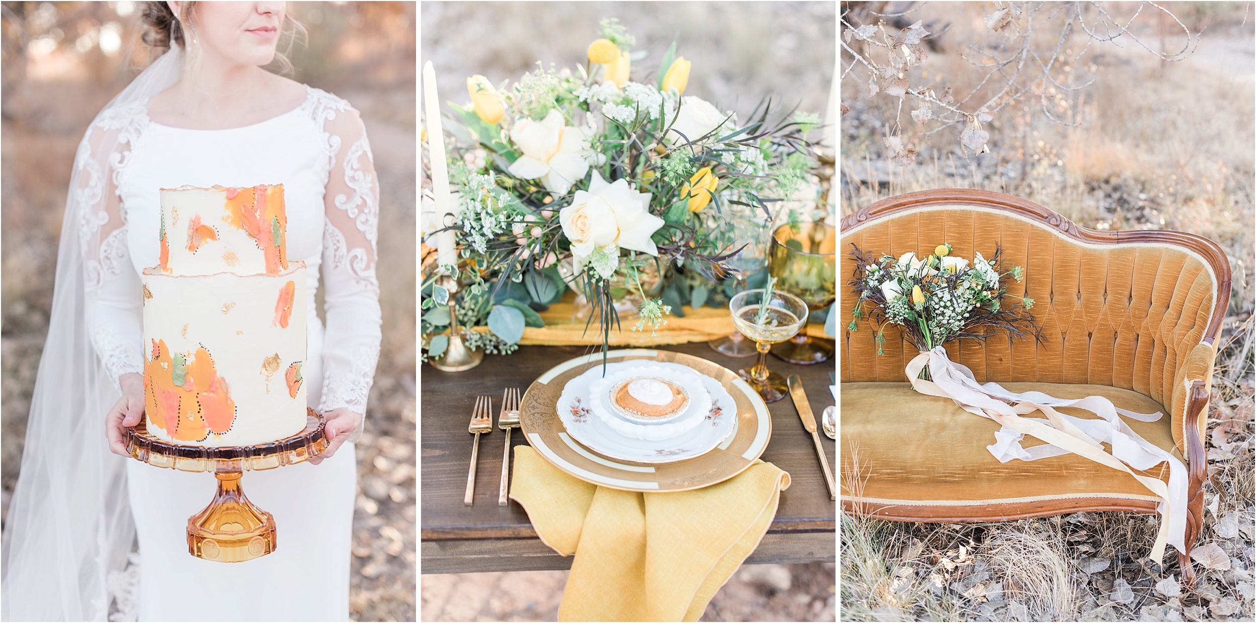
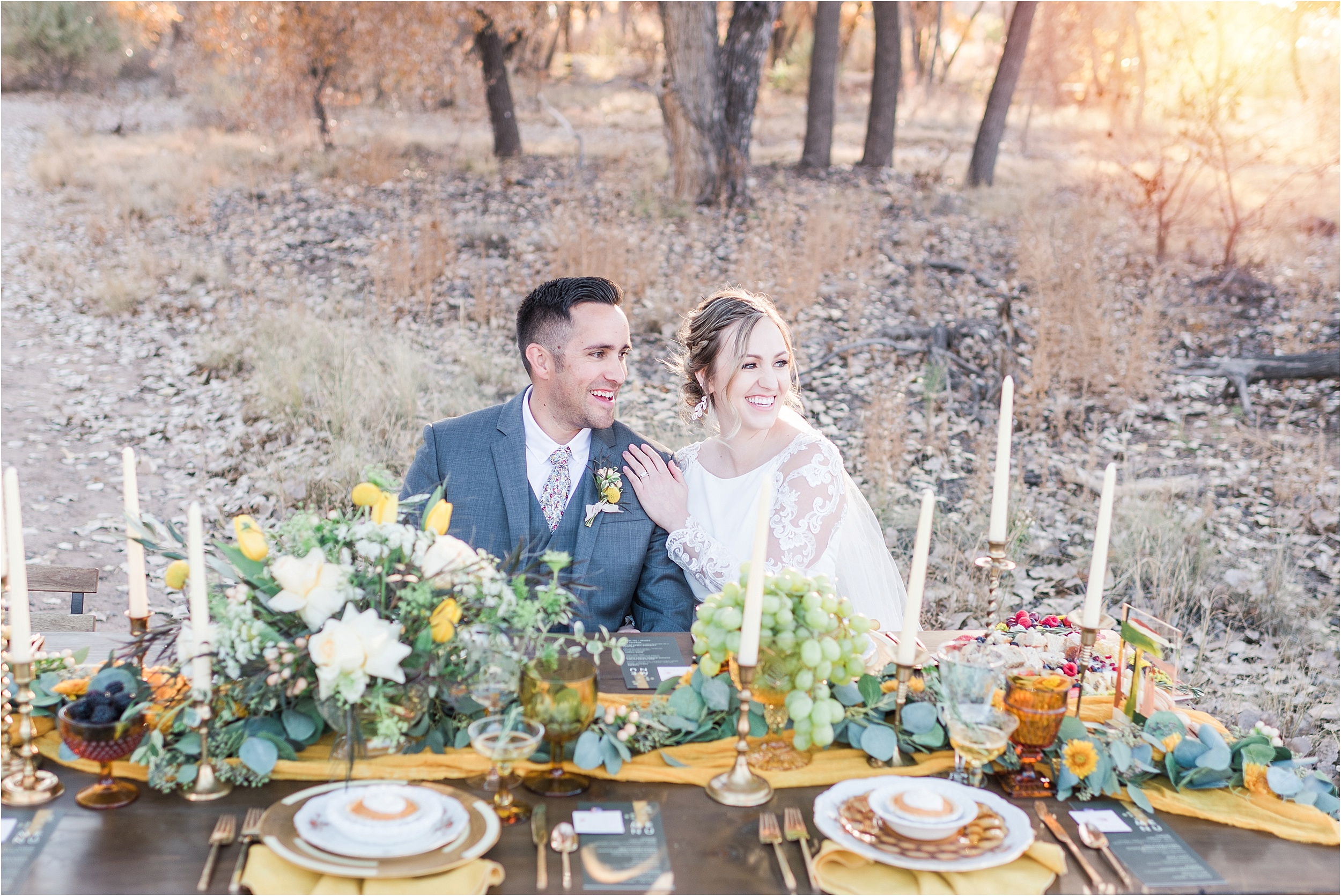
Mustard and Sage Weddings: MJP Fall Workshop
Leave a Reply Cancel reply
Welcome to Maura Jane Photography, a wedding photography team offering a personalized experience paired with exceptional storytelling.
Our Privacy Policy
design by ASHLEY FERREIRA DESIGN
Customized by amanda Mays
copyright of Maura Jane Photography 2026